About 5 years ago I’ve created a nice graph of all the bitcoin addresses. I got this:
A year later I’ve tried to recreate it, but couldn’t because my PC at that time did not have enough RAM for znort987’s parser that I had used.
Fast forward to September 2018, bitcoin now has an a fantastic simple REST interface! So I’ve tried again to create an updated graph of all unspent bitcoin transactions. Unfortunately, my previously used gnuplot script didn’t cut it any more. Too much RAM useage even for my now 32GB machine. I wrote my own renderer and fortunately it turned out to look quite nice.
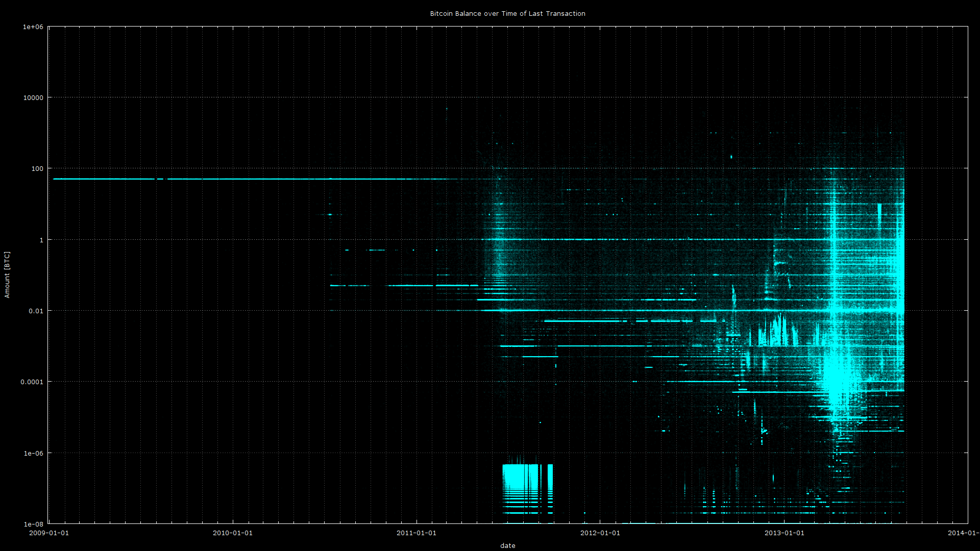
Without further ado, I give you a graph of all unspent transaction outputs as of block 542160 on September 2018:
State of UTXO September 2018 in 4K
Click on the image to see a pixel perfect 4K resolution of the UTXO:
I guess it’s time for some explanation of the graph.
- x-axis is time. It shows the block height at which an unspent transaction output has been created.
- y-axis is amount. Bottom is 1 satoshi, top is 100 000 Bitcoin. This axis is logarithmic scaled.
- The color of a pixel shows how many unspent transaction outputs are at this blockheight and this amount. It uses the excellent colormap viridis, scaled logarithmically between 1 and 1000.
Here is an example. Let’s take a random transaction. It has created two outputs: 0.66878266 BTC and 0.39275335 BTC at block 242160. These two outputs will be put as 2 pixels on the image, at the same y axis, which will make the color a bit brighter.
I believe this visualization is very interesting as it reveales quite a lot about the history of Bitcoin. E.g. The strong line to the left is at 50 BTC, these have probably been mined by Satoshi Nakamoto and might be lost forever. To the lower left there are a bunch of lines, I believe these are leftovers from the bitcoin fountains which are now mostly extinct. In the middle of the graph you can see periodic vertical lines, these happen about every 8 days or so. Could these be payouts from mining pools? What patterns can you see here?
Evolution of UTXO
The graph looks very nice, but it only shows one single state of the UTXO. But fear not, since I had to index the whole blockchain from the genesis block go arive at the UTXO set, I’ve created a video along with it. It shows the state of the UTXO set from genesis block up until September 2018. All in 4K at 60HZ (You might need google chrome instead of firefox to play in 4K resolution)
There is a lot of information to see in that video. E.g. every now and then you see how outputs are consolidated, as old blocks get darker. What else can you see?