Clearlooks Compact Gnome Theme
I have been using Ubuntu for quite a while now, but one thing I really dislike is that all the themes are huge space wasters compared to Windows XP. This finally got me angry enough to create a customized version of the Clearlooks theme that tries to be very compact but still maintain its beautiful look. I like the result quite a lot, I have been using this theme for more than two weeks now and it works great. It is especially nice for intense applications like Eclipse.
UPDATE: Human Compact Theme for Ubuntu 8.10 (Intrepid Ibex) is available!
Comparison
Move your mouse over the image to see how the dialog looks like with clearlooks-compact. The buttons and spacing are smaller, which results in much more visible space for the actual content.
More Screenshots
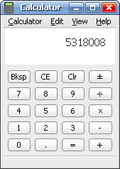
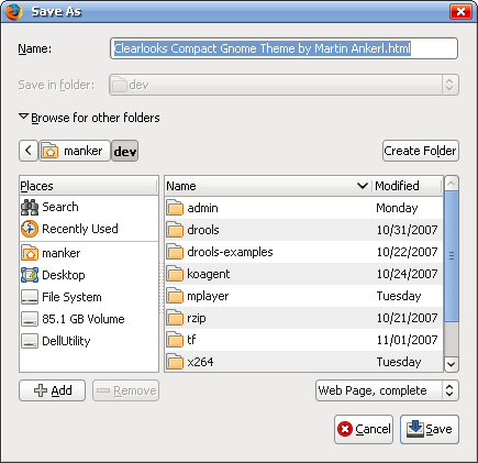
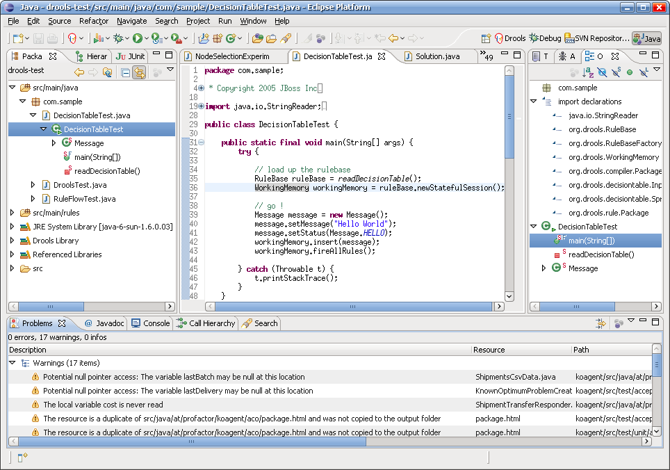
Here are some more screenshots that I have taken with Clearlooks Compact enabled. Especially the Eclipse shot is great, there the theme really shines. It is even more compact than the Windows XP look.
If you are curious, I have used Tahoma, size 9 for the application font, and the MiscFixed for the sourcecode.
Download & Installation
Installation is extremely simple, in Ubuntu 7.10 (Gutsy Gibbon) you can do it this way:
- Click System > Preferences > Appearance.
- Drag & drop the link ClearlooksCompact-1.5.tar.bz2 into the Appearence window.
Beware that this is just definition of the Clearlooks control spacings. That means you have to have the clearlooks engine installed (which you most likely have, it is the default theme of Ubuntu). To change back, click on the currently active Theme, choose “Customize”, and select other controls instead of “Clearlooks Compact”.
History
I will regularly update this page when I update the theme with a new screenshot and the development history:
- April 9th, 2009
- Version 1.5: a bit smaller checkbox + selection box, less blurry and smaller progress bar.
- April 5th, 2009
- Version 1.4: added LGPL, index.theme, version number.
- April 11th, 2008
- Version 1.3: Small panel menu
- November 11th, 2007
- Version 1.2: Major update: Smaller handlers sizes, smaller scrollbars, no scrollbar spacing, less overall padding, and some more.
- November 7th, 2007
- Version 1.1: Now even more compact by reducing the default icon size to 16×16 pixels.
- November 4th, 2007
- Version 1.0: First release of Clearlooks Compact.


Love ur work there, man!
Me too, hate the clearlooks themes, and ubuntu default theme too. Wasting to much space (like u said).
ps: u still can make it more compact. There still a plenty space between ‘Name’ and ’save to folder’ section. And ‘browse for other folders’ and ‘directory view’.
thanks!
Hi ts, glad that you like the theme. Making it more compact is difficult because I have already decreased most of the spacings to zero, as far as I know more cannot be done without hacking the clearlooks code or modifying the application itself.
Thanks for this work !
Do you think the scrollbars could be thiner ?
Its possible to make them thinner, but I don’t really like the look of it. But you can easily do this yourself: edit ~/.themes/Clearlooks Compact/gtk-2.0/gtkrc, go to line 19, and change the line
to 12 or something like that.
wow, nice work. same here, never liked the huge interface elements. now if someone tells me how you can get rid of the button images (e.g. save, cancel) i’m a happy man.
radio, edit the file ~/.gtkrc-2.0 and add this line:
Then you at least have smaller icons which should get you smaller buttons.
What Fonts you used on these sample picture?
It’s look like Tahoma in windows XP, isn’t it?
exactly, that’s tahoma, size 9.
thank you
Great theme!
Thanks a lot!
Hi,
Great man! Please keep up your good work. I really would like to see a screenshot of Windows next to one with Ubuntu and see no difference in space-waste!
Do you think this will be possible at some point? Perhaps there are hacks that go beyond the capabilities of clearlooks?
I really like your font, can you please, please, tell what you are using ?
This is the only thing refraining from doing the permanent switch to Linux….
John, I have already written this in the article, right after the screenshots
nice job!
i think your opinions are extendable to gnome/kde themes in general, they all wast lot of space.
keep this good work!
It works perfect for Ubuntu. Now I also have Suse Linux on another machine with KDE. Still I am running Eclipse which is GTK. Is there a way to apply the new Clearlooks anyway so all GTK applications look properly? How?
Nice work, indeed.
There is a small problem with context menu: when the right mouse button is pressed and kept, we can see the first position of the menu highlighted. Normally, I used click-and-release approach, so many times the first menu position is selected unconsciously.
This effect doesn’t appear in Ubuntu’s default Human theme. For me it looks like 1-pixel-to-much-of-optimization.
Excellent work, thanks.
The only thing I now like more on Eclipse in Windows is the package tree (basically tree control). The compact clearlook with small Tahoma fonts is still much less compact comparing to Windows.
Is there sth that may be done about it or as you mention couple of post above that the spacing in more places is 0 so some kind of hack is needed.
Anyway, great thanks.
I have been searching this kind of theme for ages. It seems than Gnome developers don’t really care about small resolutions…
Works fine on Linux Mint 4.0
Great Job, thanks!
Looks good, thanks.
Thank you for this theme.
Hi:
First of all, this theme is awesome - not only does it look great, but it has given me back space in the UI that I didn’t even know existed
I was wondering if you have any plans to make a Clearlooks Compact GDM Theme and Clearlooks Compact Splashscreen? I think that would provide a very complete package and make things more consistent.
Thanks
Hi, glad you like the theme. I don’t plan anything right now, because being a real minimalist I don’t use gdm and splashscreen at all
Thanks a lot for your work !
Espectially fantastic, and doesn’t affect usability for heavy keyboard shortcut users like me.
Great work! I have suffered from that for a long time.
Hi:
I love your theme (it saves so much space :D), but I have a few problems that I hope you can help with.
1) I am using Ubuntu 7.10, and sometimes, when I click the Applications, Places or System menus, they have these scroll arrows at the top and bottom (i.e. the whole menu isn’t visible, you have to scroll up and down). However, when I click those menus a second or third time, they appear normally (i.e. the whole menu is visible, with no scroll arrows). Any idea what is causing this?
2) Normally, when something gets mounted in /media, it appears in the Places menu. However, whenever I mount more than one thing, a new menu item appears called “Removable Media”, and then all of the things which are mounted under /media appear there instead. How can I change this back to default theme behaviour, where everything appears in the Places menu, with no sub-menus?
3) Sometimes when I am opening up things in gEdit from the command line, I get warning messages concerning “GtkOptionMenu::indicator_spacing” and “GtkOptionMenu::indicator_size”. Unfortunately, I don’t have the exact message in front of me, but do you have any idea what it might be?
Cheers,
Anon
Martin Ankerl,
Perfect work for a 15″ monitor at 1024x768. This was the one last thing I was searching for Eclipse and now here I am, saying goodbye to Windows (yuck!) once and for all.
Keep up the good work!
Hi! This looks like a great theme, hopefully I will have … reason to install it shortly for a specific use.
Just a very brief note: the mouse-over image in the Comparison does work in Internet Explorer (6.0), in Windows XP SP2. At least it works just fine for me here at work, and a very good comparison it is too!
Regards,
/Emil
Thanks for the theme - great work! I’m using it on Xubuntu on eeePc, and GTK apps are now much better to use. Many dialogs now fit on the screen which didn’t before.
I think it would be nice if this theme was available in Ubuntu repositories. It is certainly a good way to make the desktop work on small screen.
Great job. Thank you very much.
Could you “port” Clearlooks Compact to fit the human colours (aka brown). Blue is too cold for me, I like the warm Ubuntu tones. But the original Clearlooks takes way too much space away.
Hi steve, I am working on a Human Compact theme based on the ubuntu 8.04 theme. I will write a blog posting about this in the next few days.
If you want you can mail me at martin dot ankerl at gmail.com then I can send you what I currently have.
i got failed use this themes on application which need admin auth (aka sudo) such as synaptic, gparted etc.
same as steve. i wait for ubuntu human compact themes
thx
I will post a Human Compact theme based on Ubuntu 8.04 tonight. I have had it for a week or so and it has exactly the same spacing as Clearlooks Compact.
Update: done! see http://martin.ankerl.com/2008/05/13/human-compact-gnome-theme/
im failed install it on debian etch with gnome 2.14.3
Hi kholis, I have used it in It works in Ubuntu 7.10 and Ubuntu 8.04, I don’t know which gnome versions work
Jesus dude!!
Thanks!
You are a life savior
best theme ever!
Hey,
but when I need to execute a application with root-rights (sudo) the Theme is messed up. Is the only way to fix that starting the gnome-theme-manager as sudo and to change the theme there or is there another way?
I really like your theme but I’ve got one problem though.
When I use the theme under my normal user account everythings works finde and looks great
Greetz,
CracKPod
@CracKPod
just extract it to /usr/share/themes instead of ~/.themes, it work for me.
Very nice, thank you for sharing.
You made my day, man!
This is EXACTLY what i was looking for since I spend all day long in front of Eclipse in high-res.
many thanks
Hi,
thanks for the good work, it made my netbook far more useable!
greetings from Berlin
Sven
The idea is nice, but sometimes your theme goes too far and makes icons too small (using a GUI should not be aiming practice) and looking very crowded and ugly. We need a better compromise!
Hi test, Human Compact 8.10 is available in two version, one with small icons and one with normal icons.
Nice work! I like it.
Martin - thanks! Just installed it on Ubuntu 8.10 UNR running on an Acer Aspire One. The more compact layout just gives a little extra room. Erwin
Nice work- looks great!
Nice work, indeed.
There is a small problem with context menu: when the right mouse button is pressed and kept, we can see the first position of the menu highlighted. Normally, I used click-and-release approach, so many times the first menu position is selected unconsciously.
How can I change this behavior? Where to edit in gtkrc?
Nice theme, I love it. Couple of small problems though:
1. Checkboxes are too big IMO, this is a matter of taste, but when browsing the web using epiphany or some other browser which uses the native widgets, checkboxes size 14 tends to break the smooth compact overall look. I’ve tested using both size 12 and size 10 checkboxes, and size 10 is my favorite.
2. Progessbars look blurry. Due to the fact that the completed part of the progressbar doesn’t have the black outline that the non-completed parts have, thee progressbar end up looking a bit blurry. I’ve been toying about with gtkrc, but found now way to fix this. Hopefully you’d know how.
Is there a bugzilla/launchpad or similar for this theme? I’d love to be able to submit proper bug reports.
thanks Sindre, both of it in version 1.5. Progress bar is now sharp again and a bit smaller, checkboxes are smaller too.
martin the problem you’ve solved was certainly biting me on linux desktop. nice work!. i really appreciate it. but i think you can take it further.
Hi napster, thanks! I try to keep the original clearlooks look as much as possible, so sometimes I have to be one or two pixels bigger than possible so that it still looks as it should.
this them should become standard distribution - especially for netbooks !!!!
I am working with OpenERP - impreoves everything a lot
thank you !!!
is it possible to decrease the spacing between the Name and Save in Folder boxes in your example window?
Whow! I’m searching for that a long time ago! Thanks for the theme. Eclipse is breathing now!