Human Compact Gnome Theme (for Ubuntu 8.04)

Thanks to the overwhelming success of the Clearlooks Compact Theme and demand from several users I have now created a Human Compact theme. Basically it features the same compactness as Clearlooks Compact, but the look & feel of the Ubuntu Human theme. So, if you want compactness and did not like the cold blue look of clearlooks, this is for you. It should also work well with the Eee pc, there even is a nice tutorial here.

UPDATE: Human Compact Theme for Ubuntu 8.10 (Intrepid Ibex) is available!

Comparison

Move your mouse over the image to see the difference of a save dialog between Ubuntu’s 8.04 Human, and Human Compact. Buttons and spacing is much smaller which results in a lot more free space for the actual content. See for yourself:

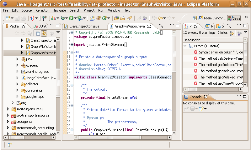
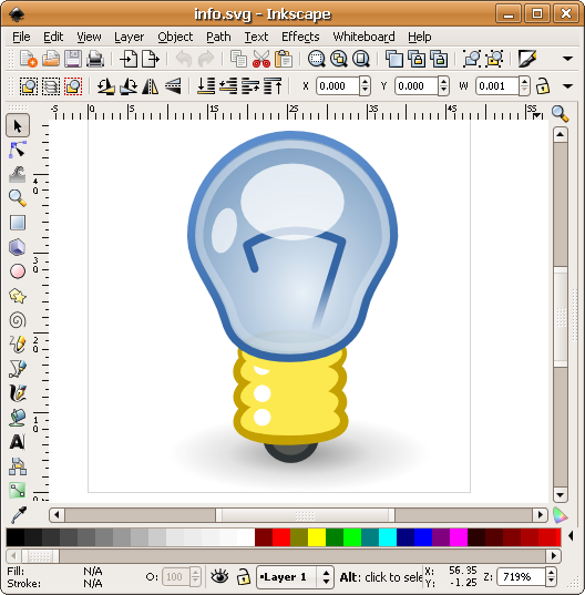
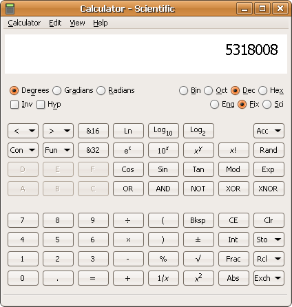
Here are some other screenshots. The eclipse window uses 800×480 resolution, which is the same as the eee pc has.


eclipse inkscape calc

Download and Installation

  1. Save the file HumanCompact.tar.bz2 to your computer.
  2. Open the gnome’s appearence dialog with System > Preferences > Appearance.
  3. Drag and drop the downloaded file into the Theme tab of the appearance dialog.
  4. Choose “Apply new theme” in the popup dialog.

Most changes will occur immediately, but for e.g. the icon sizes it is best to log out and log in again. When you change the theme, you can get the Human Compact theme back by clicking on Customize, and then selecting Human Compact.

Any question, praise or flames? please post them!

Install for root (e.g. Synaptic)

Some readers asked how to get this to work for applications that run as root (e.g. synaptic), so here it is: simply copy the copy the theme file into the root’s home directory, like this (exchange username with your own name):

sudo cp /home/username/.themes/Human Compact/gtk-2.0/gtkrc /root/.gtkrc-2.0

Afterwards synaptic uses the human compact theme.

Related posts

  1. Clearlooks Compact Gnome Theme
  2. Compact Theme Update
  3. Clearlooks Compact Update
  4. Major Clearlooks Compact Update
  5. Howto Get Enough Sleep Despite StumbleUpon with Ubuntu

42 thoughts on “Human Compact Gnome Theme (for Ubuntu 8.04)

  1. Pingback: Martin Ankerl » Blog Archive » Clearlooks Compact Gnome Theme

  2. Pingback: memperluas space gnome | kholis@home

  3. Excellent work, thank you. I would suggest keeping the large toolbar buttons in the gtkrc file to 24,24 as 16,16 might look too small on some displays. Cheers

  4. Nice work.
    Any chance of getting this into the repository’s so it automatically update’s?

    Small bug: In installing/removing programs, I installed a program and saw the progress bar have a blue color.

  5. Hi geOffrey, I am trying for a while now to get this into the Ubuntu release, but to no avail. The best thing probably is to vote for the idea, if enough users show that it is important to them they will eventually listen.

    I dont think this is a bug of the theme, because I have just taken the default Ubuntu 8.04 theme and modified the spacings. So this either is a bug of the default theme, or maybe just because you installed with sudo, and the root user might have different theme settings than your desktop user.

  6. Hi Martin,

    Great job you’ve done here, but I find that certain elements are a little *too* compact for my taste, for example the main menus and the tabs in Firefox 3.

    However, I love the effect on Save/Open dialogues and bookmark folders in FF.

    I would just like a happy medium — is there any chance you could post a HOWTO on how you altered the theme, so that people can customise it precisely to their liking?

    It would also allow us to edit the Human-Murrine theme which is nicer looking than plain Human.

    Keep up the good work,

    Laurence

  7. There’s a problem: like the problem in Firefox 3, in Nautilus the back and forward arrows are not align.
    I’m using Ubuntu 8.04, kernel 2.6.24-19, Gnome 2.22.2
    Nautilus version is the 2.22.3 (1:2.22.3-0ubuntu2 0).
    The PC is a HP NX6110 notebook with Intel® Graphics Media Accelerator 900.

  8. Why waste screen space? Fitt’s law, obviously. Smaller might give you more screen real estate, but it makes your application harder to use with a mouse or touchpad. Using a GUI shouldn’t be a aiming excercise.

    In my opinion more spacing is better for asthetics, too. Anyway, it’s still quite nice for low-res displays, but in some parts your themes overdo it…

  9. Hi Martin,

    I’m also having the problem as
    ge0ffrey with Synaptic Package Manager. It looks like it’s the old GTK theme (blue progress bar, etc.).

    I installed by drag and dropping your .bz2 archive on the Appearance Preferences window (as a user).

    Any solution?

    Thanks!
    Max

  10. Hi Max, the problem is that the theme is only installed for your desktop user, and not for the root user. This actually is a security feature. If you really want the same theme for the root user, you can copy the theme file into the root’s home directory, like this (exchange username with your own name):

    sudo cp /home/username/.themes/Human\ Compact/gtk-2.0/gtkrc /root/.gtkrc-2.0

    Afterwards synaptic has the human compact theme.

  11. Pingback: Software Engineering Blog » Compact Ubuntu Themes

  12. Thank you very much for this, I’ve been looking at how to get rid of the duplo-sized widgets for a long time now! You’re a lifesaver, I patched this into my them and am much happier now.

  13. Content Not Chrome!

    This is probably the best ubuntu theme out there. I think it could use just a tad more height on tabs and menu items, but otherwise its great.

  14. Thanks for nice theme. It looks fine on my EeePC. But there is one bug. When I open something with ‘sudo’ it looks differently. For example try to run ‘nautilus’ and ‘sudo nautilus’

  15. This is great stuff! It really makes a difference on my EEE 701.

    Previously, I was having to turn toolbars off for apps like Gnumeric and Abiword, because they took up too much room on the 7 inch screen. Since installing this theme, I’ve been able to re-enable them.

    A couple of minor points though:

    1. On my EEE, the theme always appears as “Custom” rather than with a theme name. This is before I’ve had a chance to actually make any changes to it.

    2. I’m running Ubuntu EEE, which uses the Netbook Remix. Installing the Compact Gnome Theme sets the panel to grey background with black text. Is there any way that I can set it back to the Remix theme colour of white text on black background?

    Cheers,

    - Mike

  16. Hi Mike!
    ad 1: This is not a complete theme, only the layout and colors are defined in it, not e.g. the header, that’s why it just shows as custom theme.

    ad 2: To get the netbook remix style, I’m afraid you have to edit their gtkrc file and change all the spacing so that it looks like the compact theme again. So this requires a bit of fiddling and tweaking with the configuration files, and would be a new theme. So it is definitely possible, but requires some work.

  17. Today I upgrated from Ubuntu 8.4 to 8.10 (Intrepid Ibex) and it seems that your Theme is not working out of the box. Used colors have no or very little contrast, progress bars are not displayed properly etc. A look to the preferences tells me that the theme engine “ubuntulooks” is required but not installed. A package gtk-engines-ubuntulooks is available but its installation removes “human-theme”, “ubuntu-artwork”, and “ubuntu-deskop”. Therefore I avoided its installation so far. Martin, I would very appreciaty if you are going to release a Human Compact theme compatible to Ubuntu 8.10.

  18. I appreciate that you don’t want to go through all the work of downloading a beta and all, but could you possibly post instructions on how to keep the default themes and artwork while still allowing ubuntulooks engine to be installed? I am on an EeePC 901 and really miss having the compactness of Human to retore my desktop real estate! Thanks!

  19. Pingback: Martin Ankerl » Blog Archive » How to Make a Compact Gnome Theme

  20. Impressive, useing an IBM x60 with 1024×768 spacewasters are anoying me. Perfect Theme!!!! I’m loving it!!!

    THANKS soooooo mutch!

  21. Thanks for your good work but I also think some of the elements are just too compact. For example scroll bars are almost unusable.

  22. Pingback: Martin Ankerl » Blog Archive » Human Compact Themes (for Ubuntu 8.10)

  23. For anyone wondering how to apply this to the netbook theme (for the panel), all you have to do is copy the Panel folder and panel.rc from the Human Netbook theme folder into the gtk-2.0 directory for the Compact theme, then in the gtkrc file, add the line

    include “panel.rc”

    after the comments.

  24. this theme should definitely be the default themeh for GNOME and GTK, as everything bigger is much less usable. GNOME looks so unprofessional by default with all that insane padding between the text and the button/window borders. I think one of the reasons why some beginner-lever users never make any advances with computers is because of the oversized GUI elements in Gnome and Thumbnail view of files in the Windows explorer, as the users never get a “bigger picture” of where they are and what they are doing

Leave a Reply

Your email address will not be published. Required fields are marked *

*

You may use these HTML tags and attributes: <a href="" title=""> <abbr title=""> <acronym title=""> <b> <blockquote cite=""> <cite> <code> <del datetime=""> <em> <i> <q cite=""> <strike> <strong>